How To Choose A Grout Color For Your Home!
Decorative tile is so much fun and there are some amazing options these days for all of your tiling needs. With so much emphasis on choosing the tile, we want to discuss some strategies for choosing a grout colour. The grout is often an afterthought, but the truth is that grout can make or break your tiling job.
Contrasting
Current trends are leaning towards contrasting grout colours and this can be an amazing choice for your kitchen or bathroom. The nice thing about choosing a darker shade to accent a white tile for the bathroom is that you don’t need to worry as much about keeping it bright and shiny, especially on the floors.

Image Source: Elle Decoration

Image Source: Country Road Australia
Contrasting grout with white subway tiles has a vintage quality and aesthetic. With a more modern tile shape darker grout may soften the edge of the modern design. Be careful of using very small white tiles with dark grout in a small space, as it can start to look very busy!

Image Source: The Unique Nest

Image Source: Greige Design
Earthy wood-like tiles with white grout contrasts but are still soft and light.
Dark Grey tiles with white grout is a more dramatic look but it works well in this light filled entrance way because it is meant to be the dominant feature and there is space for the floor to shine!
Matching
White grout with white tile can look amazing but make sure you seal it properly because it can be hard to keep mildew and moisture at bay with lighter grout. Grey on grey is also sophisticated and sharp, and will be easier to maintain over time. White on white looks great with wood cabinetry or accents because wood adds warmth to the design.

Image Source: Mother Mag

Image Source: Style Juicer
White grout with a white penny tile is a great option for a small busy pattern. You get the pattern you love with a little less emphasis on the tile shape.

Image Source: Studio M

Image Source: Nordic Treats Spain
Somewhere in the Middle!
A subtle contrast is a more mellow choice. Choose a light grey or bone colour to give definition to the tile but not too much drama! The tile is often one of many features in a space and it shouldn’t overwhelm the design.

Image Source: Anna Bode

Image Source: Bibby and Brady New Zealand
Sometimes the tile has to speak for itself as the case with this stone backsplash. In this kitchen a neutral grout is the best option to keep the design cohesive.
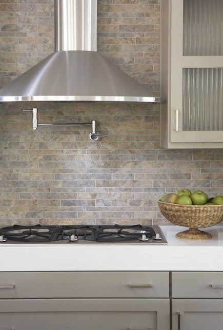
Image Source: Attic Mag
In this Space Harmony Project we wanted the tile to be accented with a neutral grout. The overall design was contemporary but soft and inviting. A more dramatic colour wouldn’t have suited the space.
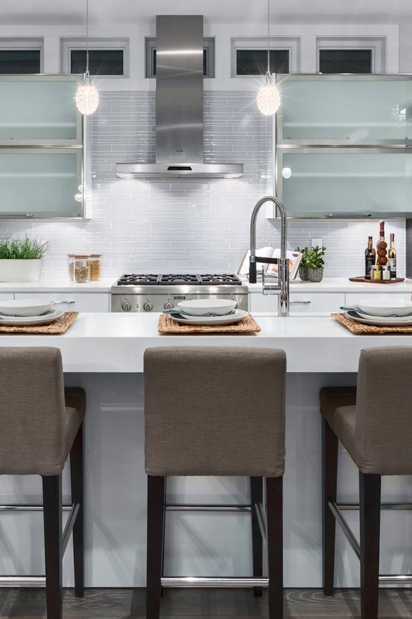
Image Source: Dunbar Residence by Space Harmony
Grout colour is more fun than expected, and more important! Choosing the right colour can depend on trends, preference or practicality. One thing is for sure, do your research and test out colours if you are unsure. Re-grouting is not a job you want to do anytime soon!