Fall Colour Report 2018
With so much access to imagery and inspiration, it seems like designers are ditching the “it” look and are working towards creating spaces for each unique client. The reintroduction of colour into the home is evidence of this concept. This fall there isn’t one specific hot colour. What we are seeing is a use of colour, texture and materials together used to create warmth, balance and personality in a space.
Instead of calling this a colour trend report, we are going to show what we are seeing and what we love in Fall 2018! Here is our fall 2018 colour report.
1. Lots of black, especially in hardware.
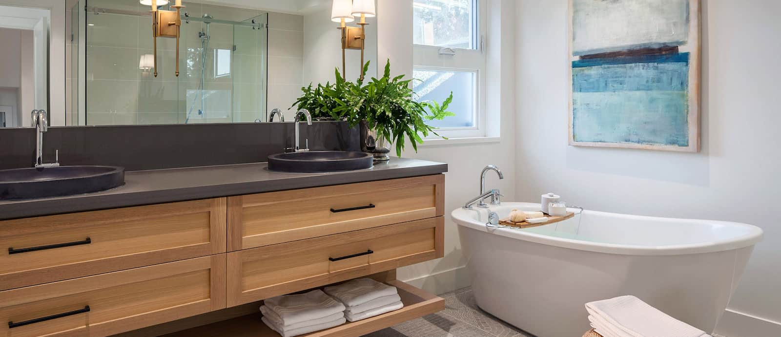
For a while we were seeing a lot of white and neutral spaces, which can be really beautifully done. We love, however seeing black back in a way that creates contrast and depth in design. It is also great to see materials being mixed in a creative way. As long as the design is good, a homeowner can choose any material that speaks to them.
Image Source: Space Harmony North Vancouver Spec Home Project
2. Pinks in homes.
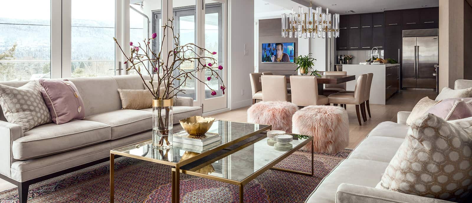
Pink has been around for a few years now but right not it seems that anything goes for this fun hue. Home is a safe space and a place to do what you love with colour. Fun, funky, soft or safe we love that designers and homeowners are embracing their love of pink.
Images Source: Space Harmony West Vancouver Custom Residence
3. Wheat as colour or texture or finish.
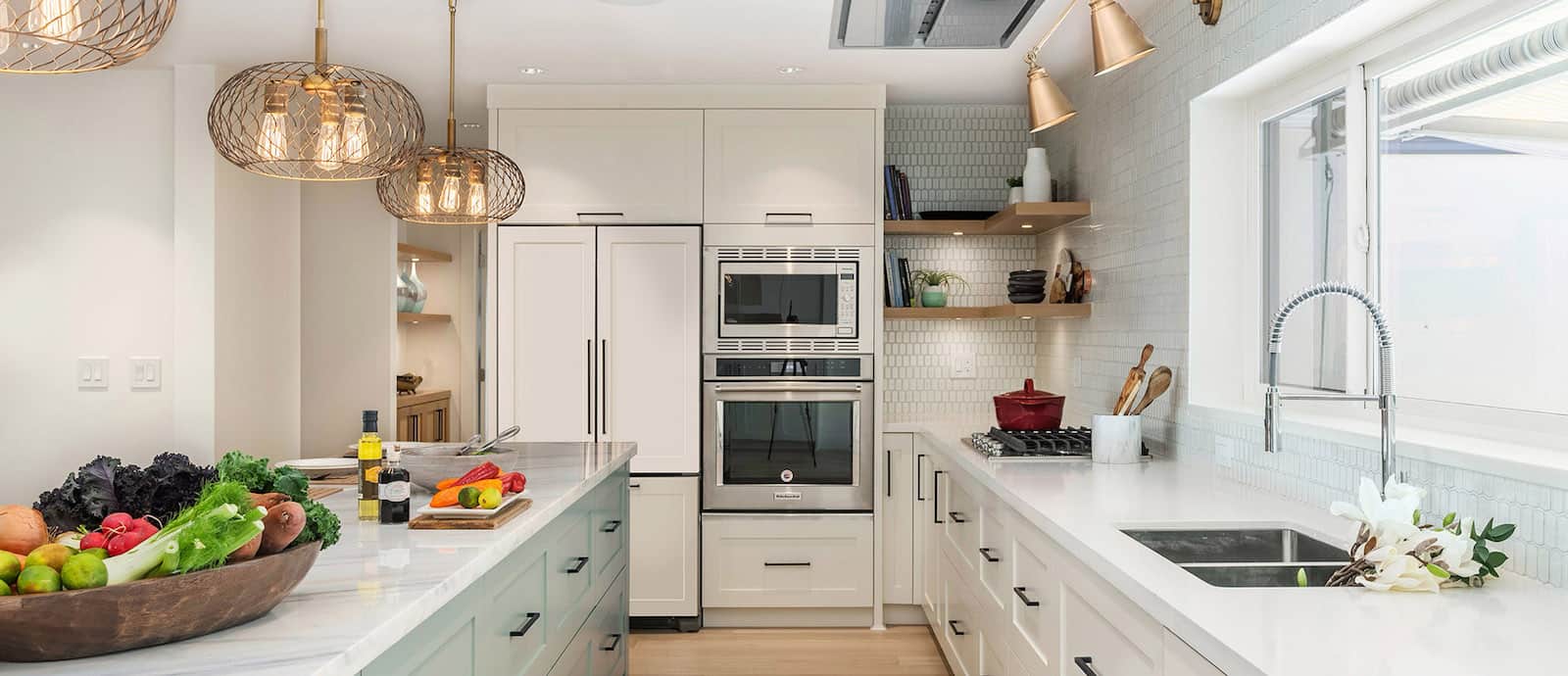
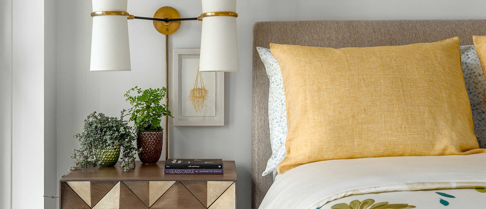
You can call it gold or wheat, and see it as rattan or metal but we love this soft, warm hue. Designers are using wheat or gold in everything from rugs to lighting fixtures and there is no denying it signals luxury and warmth. It is easy to mix with other materials and it looks divine with just about any other colour, perfect for homes.
Images Sources: Space Harmony North Vancouver Spec Home and Yaletown Residence Projects.
4. Green is back baby!
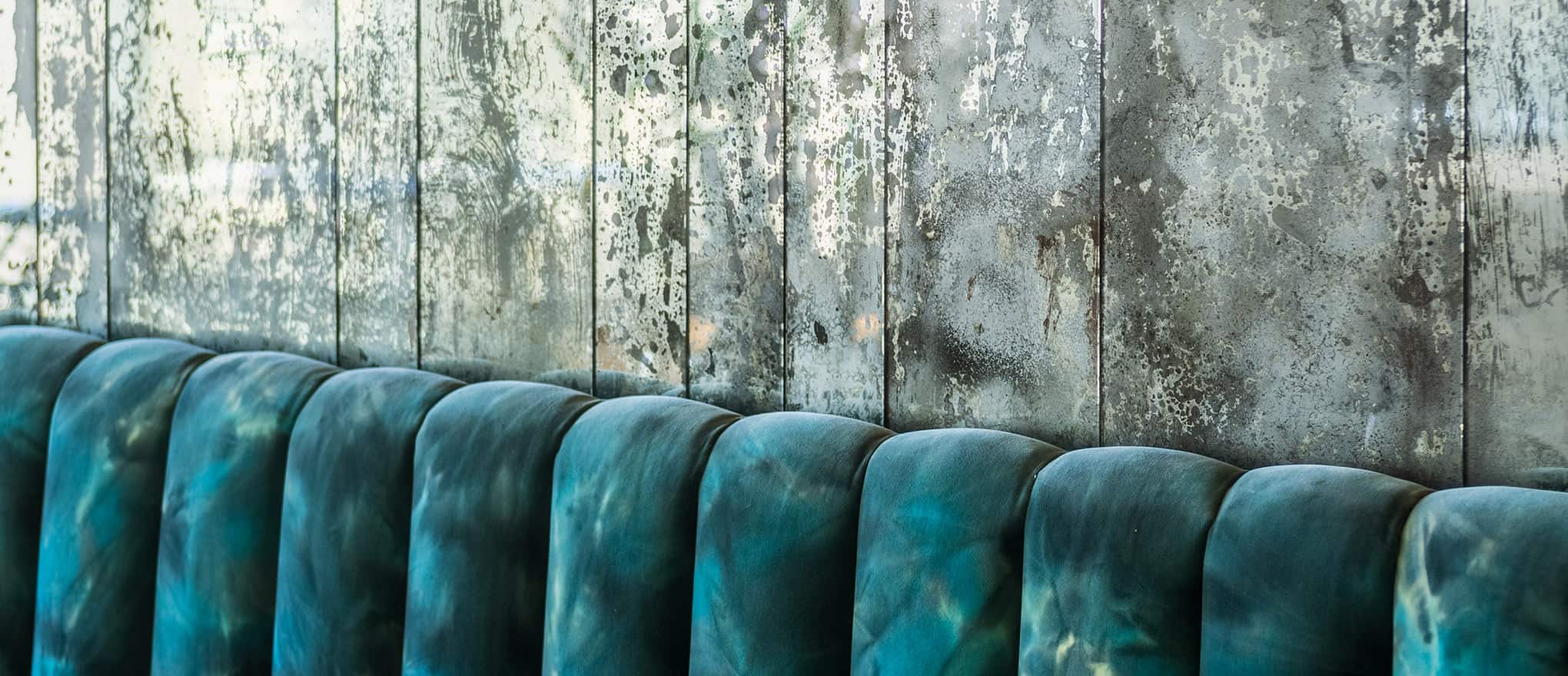
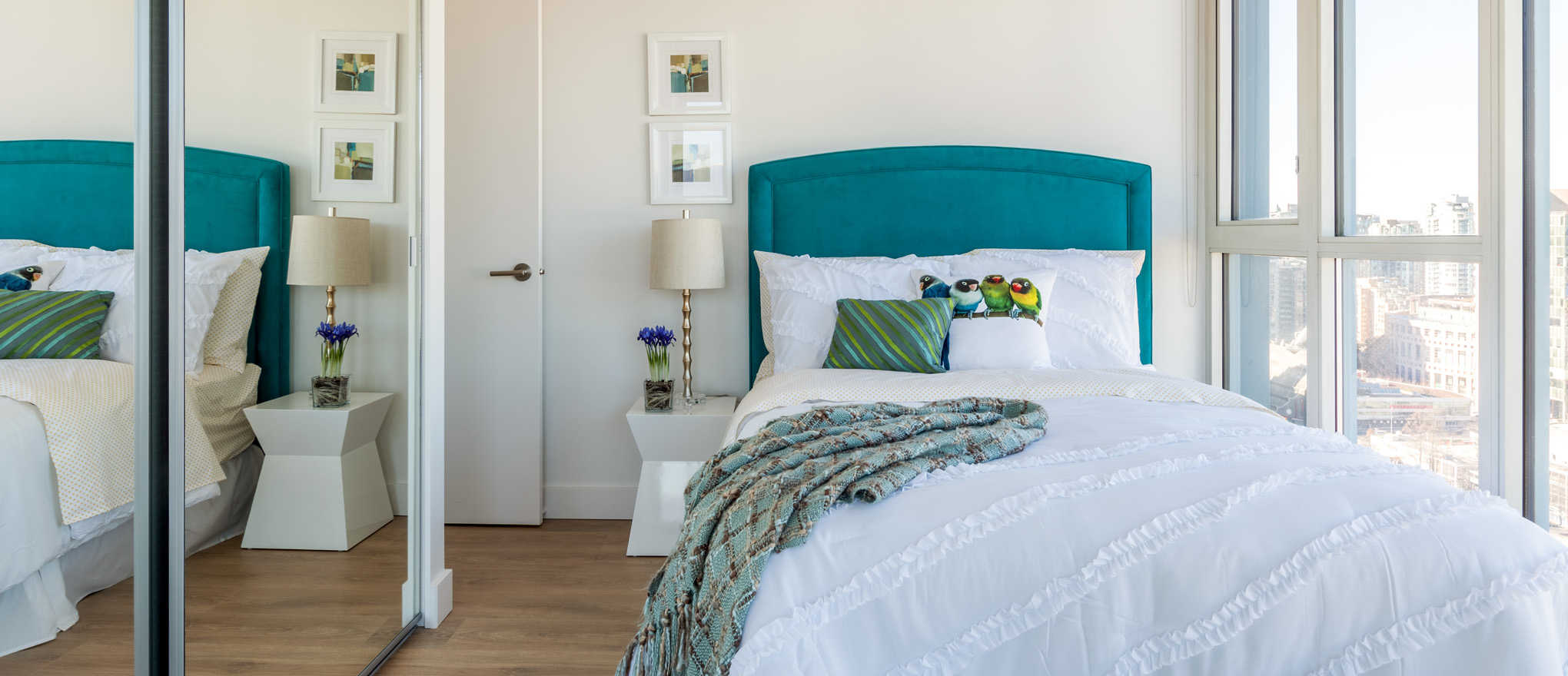
Emerald, olive and teal are all on deck this season and we couldn’t be happier. This overlooked hue is showing up in velvets, on cabinets and we love it all. Loving green means you can add drama, show off nature or keep it bright. There is no one-way to use green and that keeps designing spaces interesting, unique and timeless.
Images Sources: Space Harmony M8 Asian Fusion Restaurant and Crosstown Penthouse Projects.
As designers we are always excited for the fall but there is something special about this year and the direction interiors are taking. We love that designers are adding colour and individuality back into homes and we love sharing our favourite ways to do it!
