Top Tips For Commercial Interior Design
Lately we seem to be designing more and more for commercial spaces and we know a lot about what it takes to create a great customer experience. Here are some of our top tips for creating a successful commercial space.
Think about the customer. Market research is important and you need to know your demographic and your target market. Certain areas of the city want and need different experiences. Sometimes this means a fluctuation between form and function.
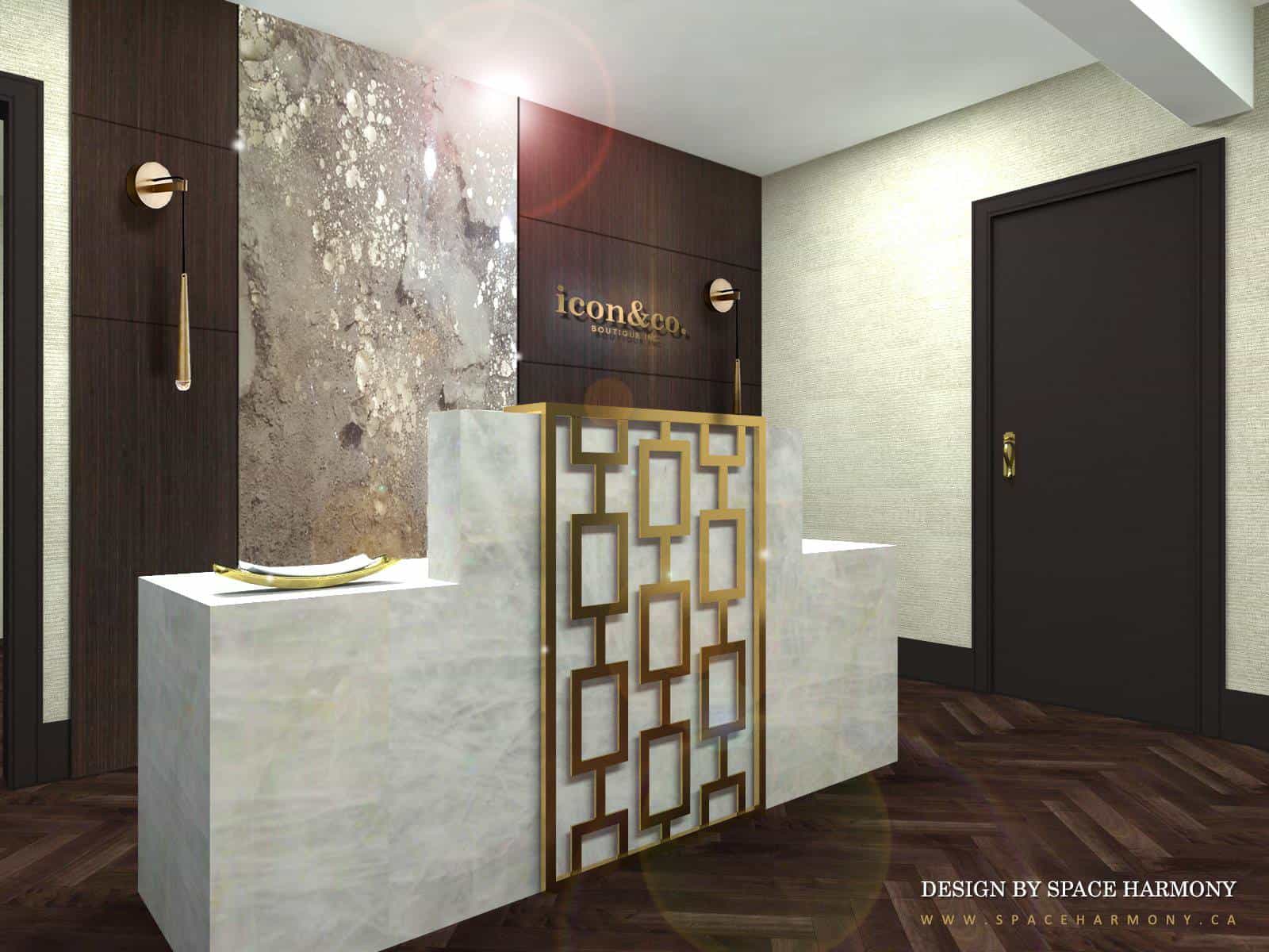
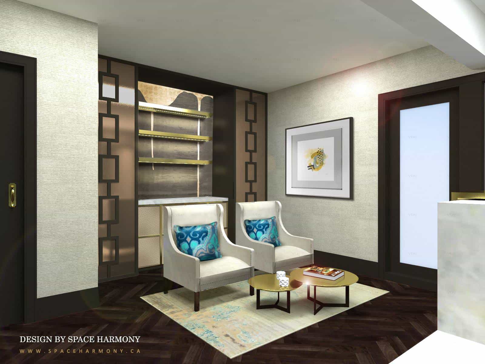
In this upscale, luxury real estate office we designed, we have taken into consideration the expectations of the customer. When someone intends to purchase a luxury property, they expect to be serviced by a luxury boutique agency and the office should look the part.
Think about the product. Often certain types of services dictate the colours and textures in a project. And sometimes the product can lead you down a very clear design path.
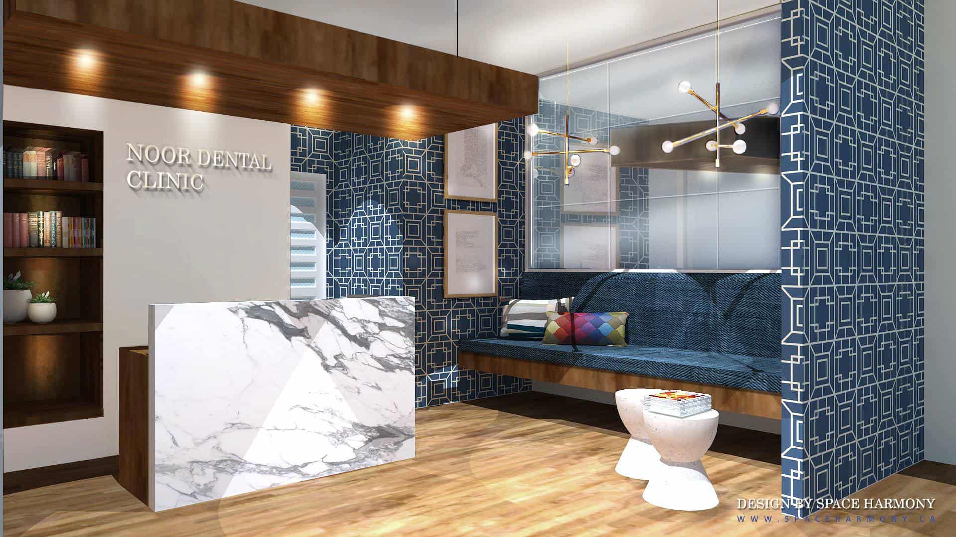
In this urban dental facility, client comfort was the most important aspect of the design. Not just that the client was physically comfortable, but that the experience of visiting the office gave the client a sense of cleanliness, comfort and reliability. We choose cool and clean colours and a graphic wallpaper to convey this. We added the warmth of the wood and marble to soften the design and add contemporary touches.
Brand the space. The physical space belonging to any company should be designed as an extension of the brand. It must have the look and feel of the company and fit with all other parts of the marketing material.
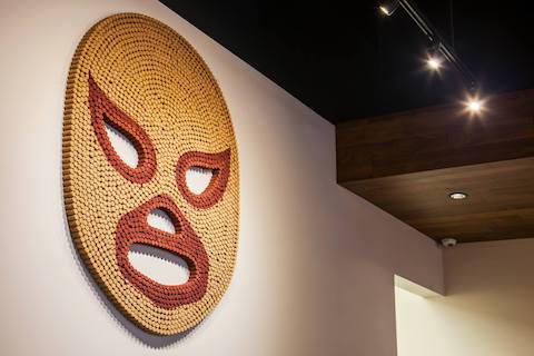
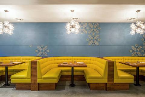
In our El Santo Mexican restaurant project we took some of the amazing brand elements from the graphic designers, including colours and logos and utilized them in the final product.
Utilize lighting and bold combos. When it comes to the fun stuff, commercial spaces are the best place to get it all out. Often commercial spaces scream for colour and pattern. This can be expressed with an accent wall, fun and funky lighting or combinations of colours and materials you might not naturally see in residential builds.
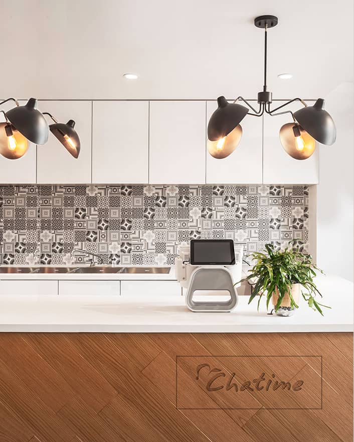
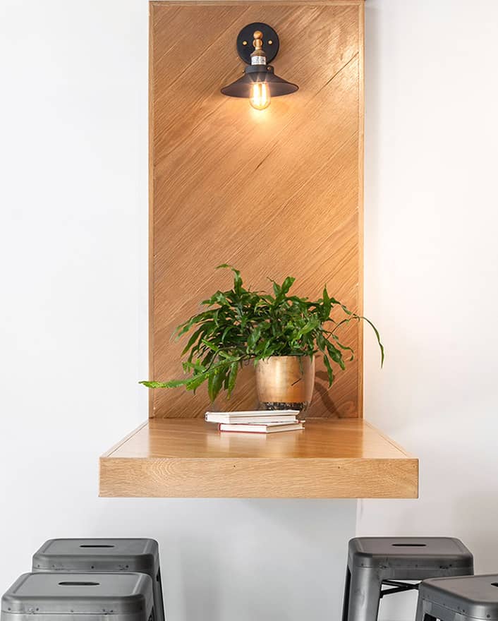
In this modern coffee shop we used really exaggerated, modern lighting. The client was also really excited to feature a black and white tile that might be overpowering in a residential space but looks amazing in an open commercial building with tons of light and room to breath!
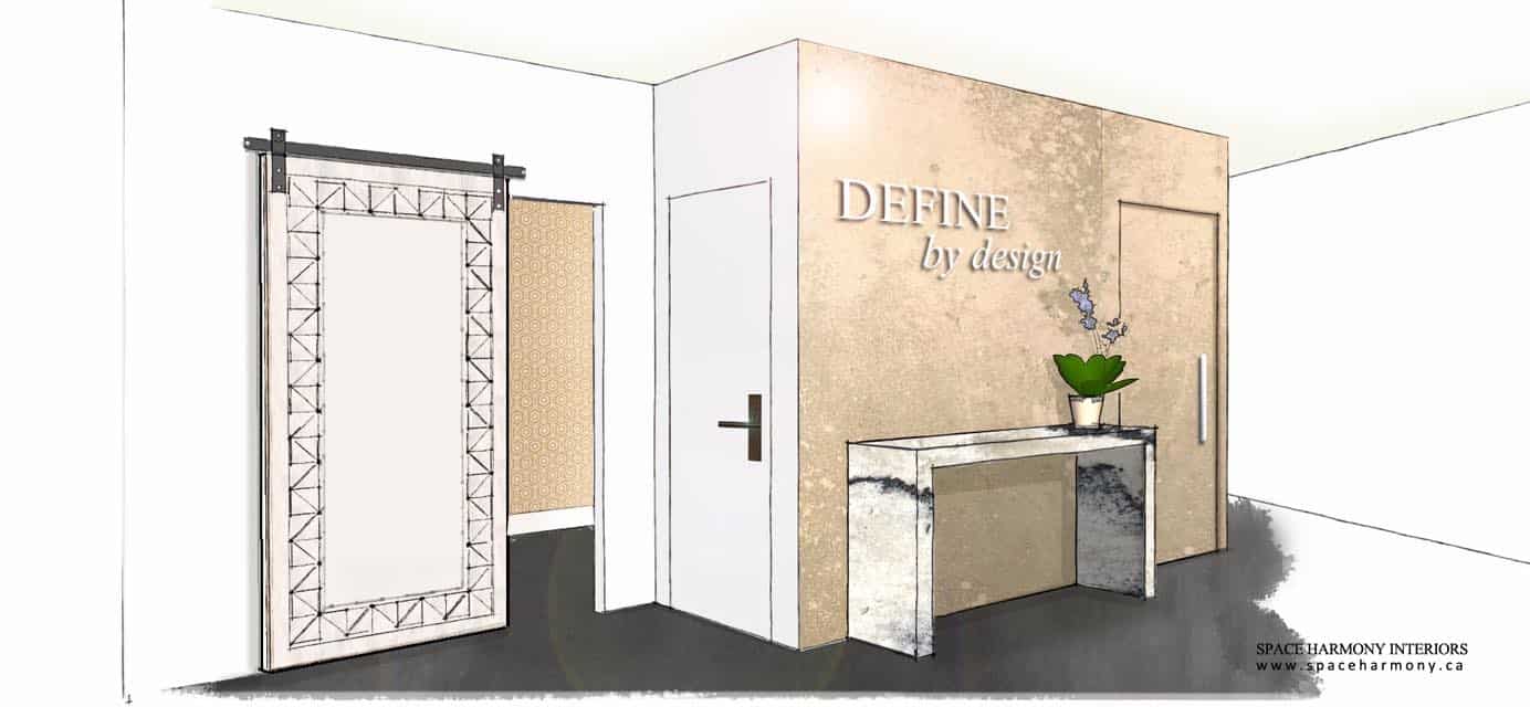
A great example of bold combinations can be seen in our design for an up and coming design firm. We used gold marble in the reception area with a totally modernized barn door to reach the backroom. An updated and modernized version of a traditional design element can be fun to experiment with in a commercial design concept.
There is a lot to consider with commercial Interior design and we are here to help. If you would like to hear more about what Space Harmony can do for you, please contact us to get started.
